Not all disabilities are visible. 1 out 5 people have mental health conditions at some point of their life, and 1 out of 10 have dyslexia.
Accessible business analytics help everyone. When your reports and data visualizations are designed to minimize cognitive load and optimized for colours and contrast, they are easily consumable even after a full day of meetings and in the bright light.
Data visualization aids decision-making and is a powerful method of communication for organizations. Therefore, it is important that as many people as possible can effectively use and understand data, regardless of their abilities. I explored the basics of accessibility and its importance in data analytics in my earlier blogpost.
Digital accessibility is not a one size fits all solution and it is impossible to reach perfectly accessible data visualization. That’s why you should prioritize progress over perfection.
Different users, different needs
The first thing to do is to consider the end-users and their needs. However, it is often difficult to identify the accessibility needs as people do not always feel safe to talk about their disabilities. Thus, a good way to start is to consider three disabilities that most often affect a person’s way of consuming data visualization: visual impairments, mental health conditions and cognitive disabilities, and motor disabilities.
Designing data visualizations can be challenging due to the diverse range of visual impairments individuals may have. These challenges include difficulties in perceiving visual cues and interpreting colors. People with low vision may experience loss of central vision, reduced contrast sensitivity, or difficulty seeing small details. Also, individuals with visual impairments might rely on assistive technologies such as screen readers, screen magnifiers, braille displays, and tactile graphics. Your visualizations should have enough contrast, larger font size for the labels, and be accessible in multiple formats, such as screen reader-friendly table format.
Complex data visualizations can overwhelm individuals with mental health conditions and cognitive disabilities such as neurodiversity and dyslexia, that often affect attention span and concentration. Allow users to customize their dashboards and choose information that is most important for them. People with dyslexia might not find text labels useful, have difficulties with visual processing of symbols, and face challenges with directionality and orientation. Also, taking these factors into consideration will help aging population.
Nowadays, many data visualizations are interactive, offering possibility to look data from multiple perspectives, create specific views and control the level of detail. However, interactive element, such as pinch-to-zoom might create accessibility barriers for people with motor disabilities.
What different tools already do for you?
Is the creation of accessible analytics thoroughly manual work, then? Well, yes and no. Business analytics platforms have some built-in accessibility features to help you. I have explored Microsoft Power BI, Tableau and Qlik and they all comply with Web Accessibility Content Guidelines (WCAG 2.0), Power BI and Tableau also with WCAG 2.1, but there are differences between the platforms.
Microsoft Power BI:
Automatic accessibility features include keyboard navigation, screen-reader compatibility, high-contrast colour view, focus mode and showing data table in screen-reader friendly format. In addition, Power BI supports alt text, titles and labels, markers, report themes, and tab order to help keyboard users to navigate reports in the same order as users who are consuming them visually. However, they require configuration from the report developer. The downside of Power BI is that it is laborous to add patterns to your visualizations.
Tableau:
Automatic accessibility features are keyboard navigation, screen reader tags, high-contrast colour schemes and programmatic context for assistive technologies. Tableau creates alt texts automatically, which you customize yourself starting from Tableau Cloud 23.2 and Tableau Desktop 23.3. One downside is that you need to edit dashboard hierarchy for screen reader objects in XML.
Qlik:
Qlik has only basic features such as default colour schemes with high colour contrast, keyboard navigation, keyboard shortcuts and screen reader support. The downside is that only some of the chart types come with table view.
For a more comprehensive overview of data visualization tools, Urban institute has created matrix with four high-level variables: ease of making a visualization from data, expressiveness of the visuals, out-of-the-box (ready-to-go) accessibility, robust/flexible potential of the accessibility.
If tools help only so much, what I need to do?
As many accessibility features are design choices, the responsibility is largely at the hands of a report developer.
For demonstration, I have created few example charts that are accessible by design. Typically, in data visualization, you are using given brand colours, so in the examples, I use colours as close to Tietoevry’s visual identity as possible.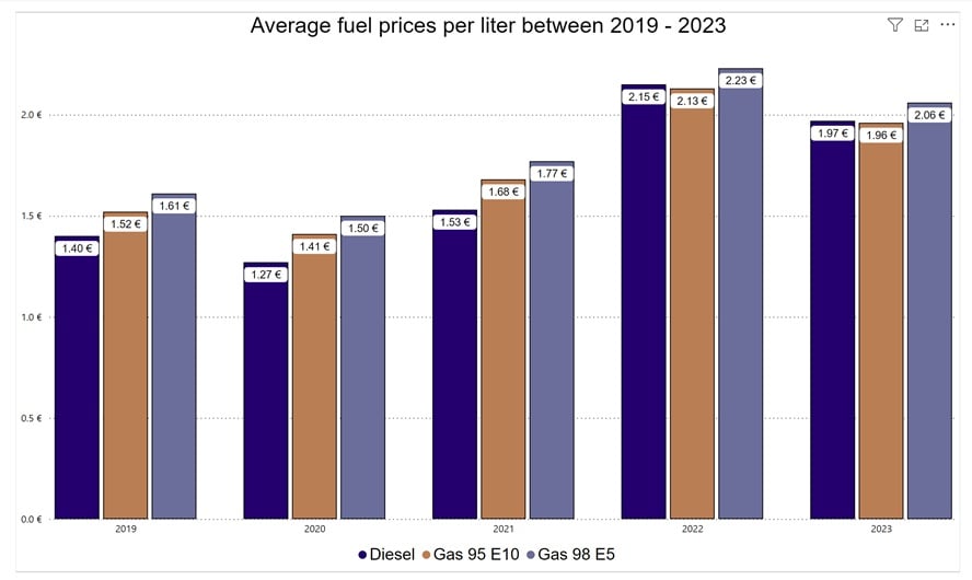
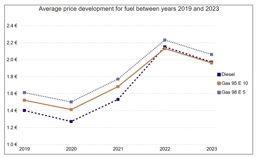
Two charts above are created with Microsoft Power BI and they include the following accessibility design choices:
- High as possible colour contrast
- Dyslexia friendly font (Arial)
- Font sizes minimum 10 px
- White space between bars
- Patterned lines in addition to different colours
- In the line chart, there are no data labels as they would make the chart harder to read. Context of the chart is to describe the change in prices, so the exact amount is not necessary information.
- Data markers
- Alt text
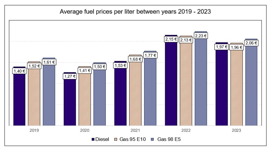
Creating the similar bar chart in Excel provides the following improvement to accessibility:
- Patterned middle bar for differentiation, to compensate suboptimal colour contrast
How to get started?
The best way to support report developers is to create aligned accessible data visualization guidelines. Does your organization already have such principles in place?
If you are wondering how to make your existing data visualizations more accessible for diverse group of users, a good place to start is a business analytics accessibility assessment. As accessibility specialists, we can provide you with current state analysis and recommended adjustments you need to make.
Learn more about Tietoevry Create’s accessibility services.